For the past several months, I’ve been enmeshed in the writing of a(nother) book, on a topic that only marginally involves websites. During my research, I read a terrific book by marketing expert Jay Baer, called Youtility. In his book, Baer discusses the huge shift that online marketing is currently undergoing: from being purely a promotional medium, to the beginning of understanding that people don’t want even want promotional content: they want stuff that’s actually relevant to them. (I discussed a similar idea in this blog post about payoffs).
Baer calls the concept “youtility,” and it’s been a difficult change for many marketers to make. We, in libraries, have the same problem. We shout promotional messages from our websites, our social media accounts, and our emails, hoping that something might resonate with someone, somewhere. But there’s simply way too much content out there for people to absorb, so anything that doesn’t scream “USEFUL!” tends to fall on deaf ears (with the exception of entertaining content, because, hey, who doesn’t watch cat videos?)
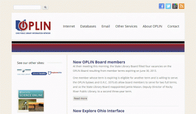
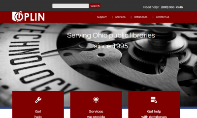
Another project I’ve been involved with recently is the overhaul of my employer’s website. We took a long, hard look at our website data, and it immediately was clear that users only came to our website for a very limited number of things.With this redesign, we made a very conscious decision to move completely away from promoting anything on our website, and to make the most common tasks as clear as possible.
I was very happy about this; not just because it embodied the idea of “youtility,” but because it was clear buy-in, at the administrative level, that users come first. Collectively, we recognized that our job was to serve people, and our data showed plainly which services people wanted to use. That doesn’t mean there isn’t other content on our website (there’s plenty), but it’s not front and center. Not everything can, or should be.

The old website

The new website
I’m sure we’ll make changes as issues arise, but so far the reaction has been very positive. It helps that nothing is set in stone.
Our new website has started some discussions with some of our client libraries. I’ve fielded at least a couple of calls already, that start with something like “I really like your new website. Can ours look something like that?” The answer, of course is “yes,” but I spend some time explaining how we came to that design. Yes, it’s more modern, yes, it’s cleaner. But the thinking behind it is very different than what most library websites currently use, and it did require a major shift in how we approached our marketing. We decided to use other channels for any promotional content (and even then, you have to keep purely promotional stuff as a low percentage, or people tune out). Our website is more like a self-check lane at the grocery store, where you can easily click a button for assistance, if needed. Before libraries could adopt something exactly like what we have, they would need to sit down and ponder if they’re ready to give up the website as a promotional channel. (Honestly, you probably should. Here’s more about that: Your Website Is No Place for Promoting Your Services. )
To make this move, your library has to realize that the web has become increasingly task-focused. People want what they want, when they want it. Not what the library wants,. The tendency to put tons of “Come to/do this at the library!” has to be overridden (and there are very good reasons for doing less of that, anyway).
Do you think your library could (or even should) make this shift?
Hi Laura,
Great post! Your updated OPLN splash page is clean and virtually text-less. Many websites are undergoing the same transition. I agree that patrons shouldn’t be forced to shift through library promos to get to what they want. However, I’m wondering how the removal of all, if not most, text will effect web viewers in the long run. Wouldn’t it be a fascinating project to research the evolution of websites over the years to see if there were any correlations between reading habits and web design?