
Many libraries devote significant resources to their website. It’s important to know how it’s being used (and not being used). Google Analytics is a popular tool for website analytics, but I have to admit – it scares me. It’s an incredible product, especially since it’s free, but it is overwhelming for nearly everyone, even paid professionals. I’ve even taken courses on GA, yet I still sometimes feel like an idiot when I’m digging through stats, trying to figure out what’s going on with a given website. Apparently, I’m not the only one who struggles to make sense of the data, because now there is at least one tool to help make sense of the everything-even-the-kitchen-sink approach Google Analytics takes: Visual.ly.
Visual.ly is an online company that doesn’t do a whole lot for free. It’s known for creating infographics and data visualizations, for a price. Visual.ly infographics have been featured by major news outlets, such as NPR and the Huffington Post. However, there is a little-known feature that is free, and I have found it to be a lifesaver that keeps me from having a complete meltdown when dealing with website analytics. Visual.ly has a tool that will automatically scan your Google Analytics data and send the most relevant pieces to you once a week, as an infographic.
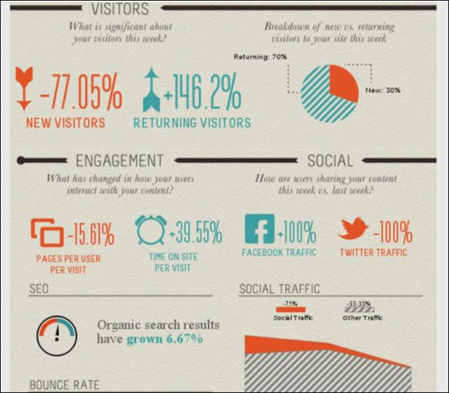
As you can see from the partial screenshot above, it’s very clear what’s doing well (and what isn’t) from the data. The nice thing about this tool is that it not only gives a visual picture of the data, it makes it plain what represents “good” and “bad” data. The only thing this can’t tell you is how to actually use the data to make your website or blog better (and I’m not yet aware of a tool that can do that; if you know one, please share). However, this is an excellent report to share with administrators.
What does this mean to me, Laura?
- If you often forget to go check out how your website is doing with Google Analytics, this service is particularly useful, as it emails reports to you directly.
- You will, of course, need a Google Analytics account already all set up and having been collected data. You’ll need to log into Visual.ly with your Google account and link it to Visual.ly, in order for this to work.
- There are even sharing options available, for Facebook, Twitter and Pinterest.
- The infographic can be downloaded as either a PDF or an image from the Visual.ly site.
- This is not an in-depth report, and it’s not meant to be. However, it is a nice overview of activity for the week.