Colors can be fun, but they can also be complicated. There’s a lot of psychology involved with choosing colors as well. I really enjoy putting together or finding color palettes for different websites or projects that I get to work on, but the task is always accompanied by a sense of knowing that a lot of people will be judging my choices.
I’ve come to rely on several color-related tools that make my job easier, and I thought some of you might find these useful, as well.
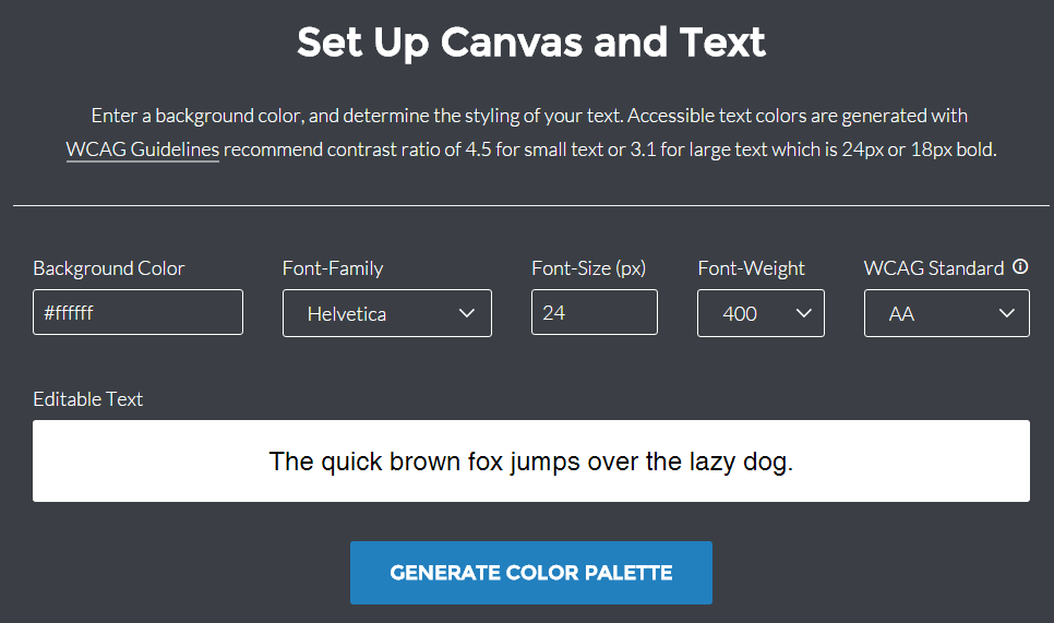
Worried that your color scheme doesn’t have enough contrast? Will text be too difficult to see on that background color–especially for someone who might be somehow visually impaired? You might be right. Use this tool to find out. Put in the hexidecimal value of your background color, along with some other values, and Color Safe will figure out which colors have enough contrast to be used as text.
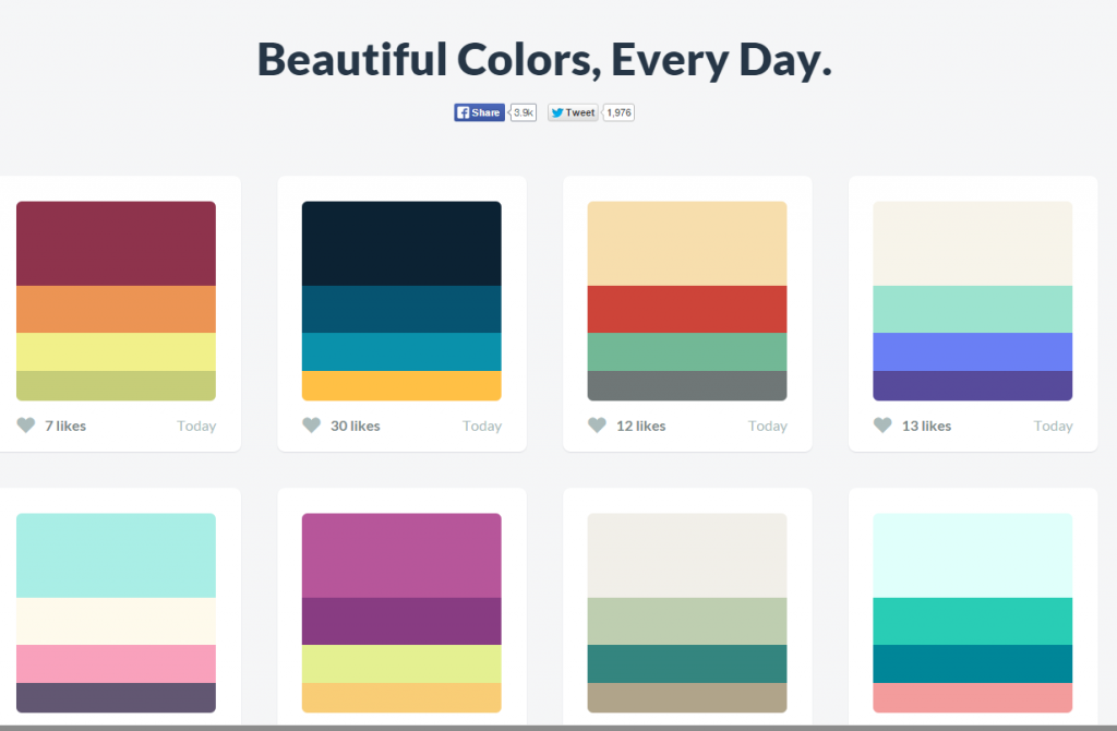
Need inspiration? This simple site provides lots of palettes to choose from, and you can also see which are more popular than others. You can even use this tool to create your own scheme to test and/or contribute.
This tool has been around for a long time, and is popular with professional designers. You can adjust color scheme components or create a new palette from scratch. The “Explore” option also gives you lots of contributed palettes to choose from. The main difference between Kuler and Color Hunt is the complexity; you can get very granular control from Kuler.
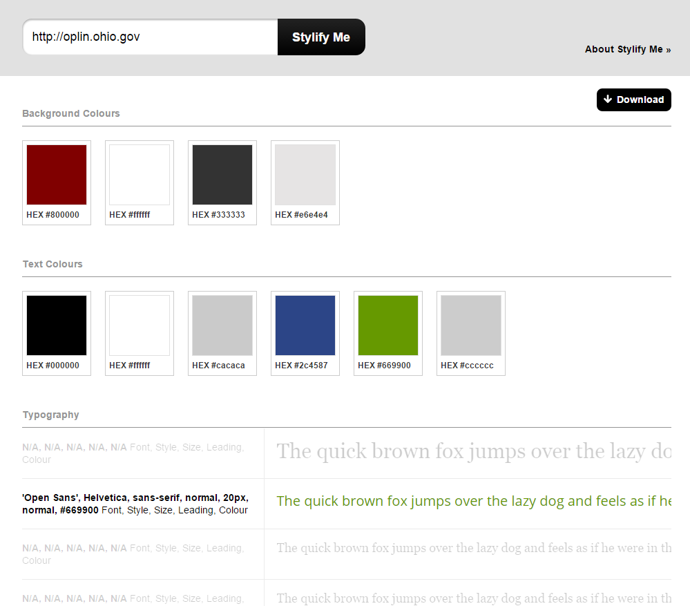
Stylify Me isn’t just a color tool; it’s kind of a “how did they do that?” tool. Just give it a URL of a site you like, and it will quickly list all of the colors and fonts used. You could dig around in a site’s CSS code, but this tool saves you a bunch of time.
Do you use other color tools? Or, what do you think of these? Please share in the comments!


