
People are naturally drawn to what’s attractive and easy to understand. Oversized logos, on the other hand, are aggressive and tacky; think of it as visually shouting at your consumers.
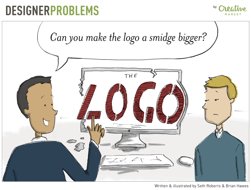
Your library is (probably) proud of its logo. It might have cost a mint to have a professional create it (and a professional should have created it), and you understandably want it everywhere. But one of the most common design requests I (and most other web designers) get is “make the logo bigger!”
Honestly, I just want to copy and paste Cole’s entire post here, because it’s succinct and clearly explains why big logos are a poor practice. The reality that many libraries have to contend with is not having professionally-trained marketers available. As a result, many libraries also don’t have access to industry knowledge that could prevent them from making these kinds of mistakes.
Look at Nike’s site and look at the logo. Why does your library’s need to take up 1/3 to 1/2 of the header space? Short answer: it doesn’t. The purpose of a logo is to provide a visual cue as to where the visitor is in cyberspace. Making the logo larger doesn’t change that purpose, and it doesn’t help the visitor in any way. It’s an egotistical practice that usually gets in the way of the user. So, another short answer: no, I probably will not make your logo bigger.
From https://creativemarket.com/blog/designer-problems-comic-3-the-logo