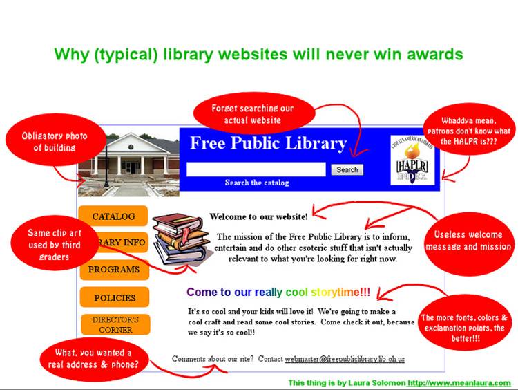
I wasn’t able to share this at my Computers in Libraries presentation (not enough time!), so I wanted to post it here. What other issues do you see that consistently plague library websites?
I wasn’t able to share this at my Computers in Libraries presentation (not enough time!), so I wanted to post it here. What other issues do you see that consistently plague library websites?
Comments are closed.
Ouch!
The biggest problem I’ve seen is that, because of the politics of dividing available virtual space between different departments, the homepage of the library is more useful as an organization chart than as a guide to useful services.