
Getting people to share stuff, especially via social media channels, is always a challenge. I’ve tried various WordPress plugins and sharing buttons for my blog, but never been really happy with how most operated; typically, most required being at the bottom of my content and/or I didn’t get to pick the specific channels featured. So, sharing buttons that were hidden at the bottom of a post and then had too many options have always been a sort of annoyance for me…and, I’m guessing, probably for blog readers.
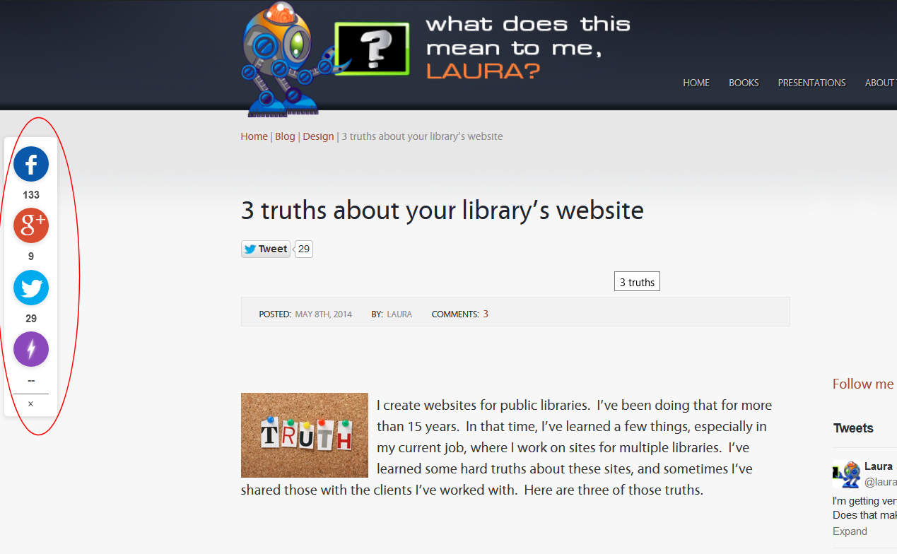
Enter a new player: Flare by Filament. It’s a slick sharing interface, highly customizable, and it has a fixed position on the page. When a reader scrolls up or down, the sharing widget doesn’t move. Here’s what it looks like (and, of course, you can see it on any blog posts here):
What does this mean to me, Laura?
- It’s available for WordPress, Tumblr and static HTML installations. With a little tweaking, I’d bet that other CMSs (e.g, Drupal, Joomla et al) could probably use this, also. It’s basically an embedded code snippet that talks to your (free) Flare account.
- That purple “flare” button, at the bottom? You need a Pro account to remove that. The Pro account also adds some branding. I’ll think about it.
- You can set the position of the widget. Flare actually has a pretty slick, no-tech-required interface for customizing the location, which services to connect to, and other features.
- When I installed this to my WordPress blog, Flare automatically figured out what different kinds of content I had and offered me the choice to only have the widget appear on certain content types.
Here’s one screenshot from the configuration interface:

Is this something you would consider? Post below and tell me what you think of the new widget…please?
I’m old, so measure out requisite grains of salt. I don’t like elements that don’t scroll with the rest of the page. This gets a point because it’s stable (I really hate the things that start to scroll then pop back into place). At my current, preferred browser window width, the Flair box is in my way. I’d prefer to have this Comment Entry box in the middle of my window when typing, but to avoid Flair, I have to position the box above or below.
I also find this visually annoying. I can’t figure out what the circling splotch does, and while it might make it easier for some to share, it also distracts from the content, which is what gives me a reason to share.
In the interest of full disclosure, I dislike the social media sharing buttons anyway. I’m not sure about Filament, but many of these types of buttons track users even if they don’t click on them. It seems likely that this is the case for this product as well, since free needs to be paid for somehow. This may cause some who are concerned about privacy from returning to your site, although I think that awareness of this issue is low.
I think that most people who are inclined to share have already set up their own preferred methods for doing so. Clicking on a button means I have to enter the service through my browser, instead of the app that I usually have set up, and need to log in. Copying and pasting the URL is easier and gives me more control.
I do like the customization options!
Interesting tool, but wondering if there’s a setting to keep it from blocking view of page? On iPad/safari it’s blocking the text on the left, making it hard to read around it. But I do like the look of it.